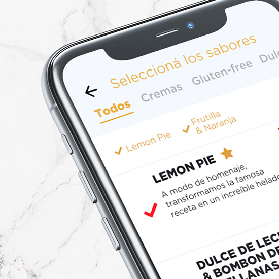
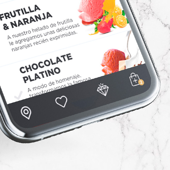
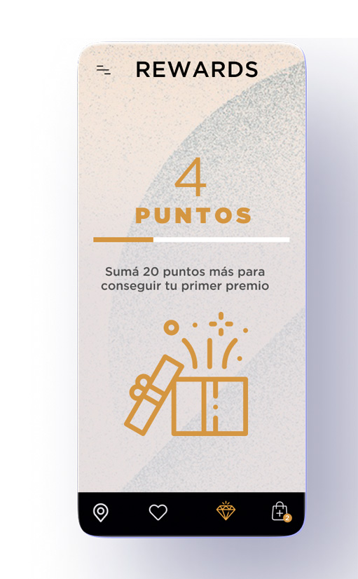
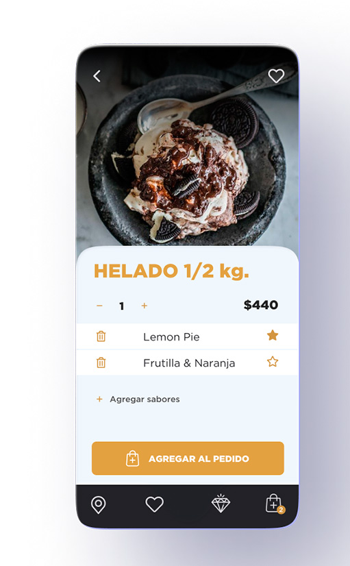
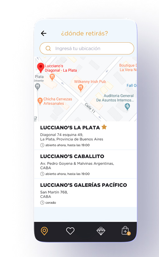
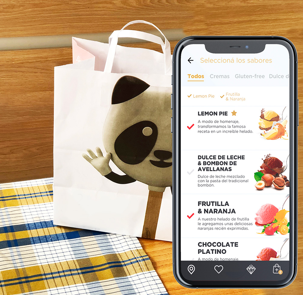
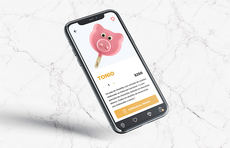
App UI
Designed in FigmaThe challenge was to provide their customers with a highly customized way of ordering ice-cream and avoid stores getting crowded due to the Covid-19 context.
The process
Designed in FigmaThe challenge was to provide their customers with a highly customized way of ordering ice-cream and avoid stores getting crowded due to the Covid-19 context.
UX ResearchBenchmarking provided insight regarding the visual design and the information architecture patterns present in ice-cream buy and pick-up apps and related cases of study.
Ethnographic interviews showed that, before Covid-19 pandemic began, customers had usually felt delighted while buying ice-cream at the client’s physical stores due to the sophisticated and excitist character of the ambience and architecture there. The visual design then reflects the visual identity of the brand, and it’s excitist and cool spirit.
Ethnographic interviews showed that, before Covid-19 pandemic began, customers had usually felt delighted while buying ice-cream at the client’s physical stores due to the sophisticated and excitist character of the ambience and architecture there. The visual design then reflects the visual identity of the brand, and it’s excitist and cool spirit.
The process
- Moodboard built in Pinterest
- Defining color palette, typographies and icons style
- Rapid prototyping, creating wireframes with pen and paper
- Designing high definition mock-ups in Figma
- Usability Testing with users identified as ice-cream lovers to find pain points and improvement opportunities
- Promo mock-ups with the screens being used in context were designed
View one of the project’s Figma files here.

