Part of the Thesis Project at the Visual Communication Design career at Facultad de Bellas Artes (Universidad Nacional de La Plata). The result was a proposal that solved out the problems that Roche‘s visual identity had in that moment (2010).
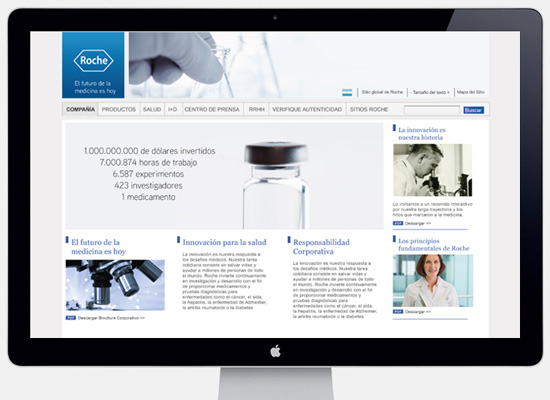
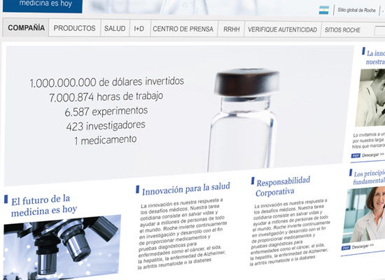
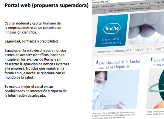
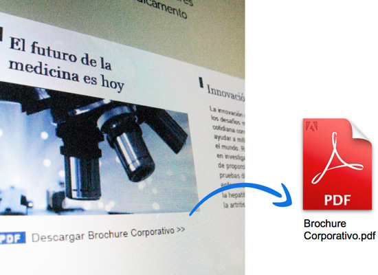
Redesign and information re-structuring for the institutional website of this pharmaceutical company. This proposal arrived to a solution that takes more advantage of the possibilities that internet as a channel offers in matter of interaction and rich media display.
Previously to the visual proposal development, an extensive analysis was done about the relevant information that the company should include or disregard on internet in front of its audience, concentrating on the website user’s profile and characteristics.
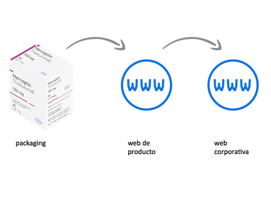
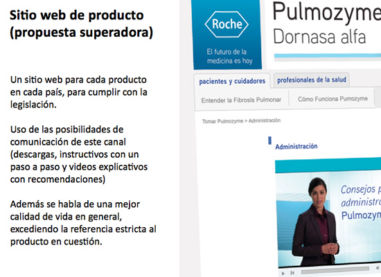
Parameters for graphic elements usage, for taxonomy and for information architecture were established for every product’s website.
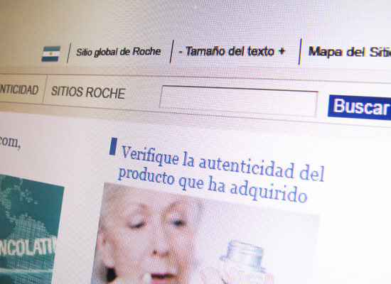
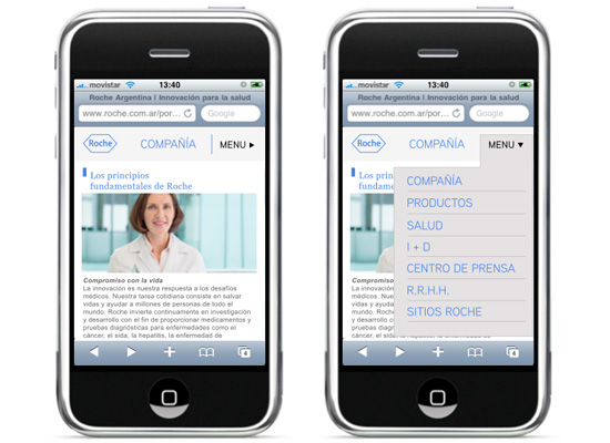
Besides, given the fact that Roche‘s audience is massive, the proposal has worked over universal accessibility, establishing technologic and organizational guidelines to adapt the site to different mobile devices.
The key concept and guiding premise for designing a new face for Roche© was“scientific innovation”.

